For the love of unrounded rects
Ah, unrounded rectangles. Sometime your perception of something is so tied up in nostalgia it's impossible to really look at it and pretend that there isn't some element of yearning for the past.
Before the turn of the millennium people weren't afraid to draw a rectangle on a computer screen. Now, an unrounded rectangle comes across as unsophisticated. A marker of inattention to keeping up with the times. You think of the inscrutable and cryptic interfaces you only catch glimpses of. A glance at the computer at an airline service counter, a glimpse as the bank teller rotates their monitor.
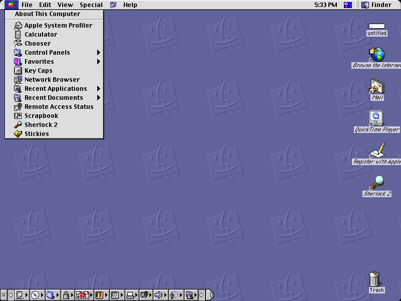
And then came Mac OS X. At least, that's the demarcation for me. I remember entering middle school and seeing the bubbly iMacs in the library. My first impression is that they felt fundamentally unserious and goofy.
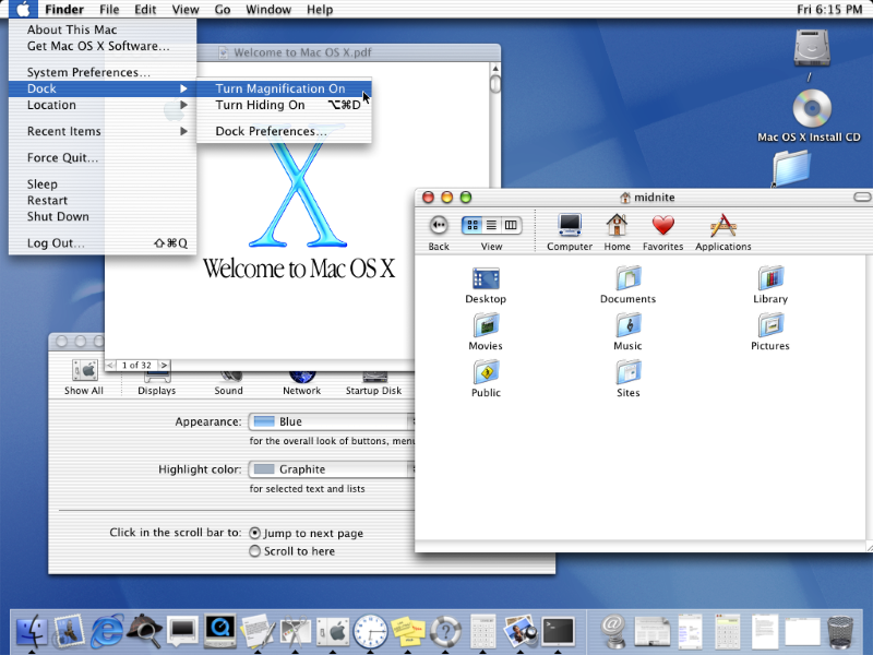
Over time I came around to this vibe, however. It became clear that computers weren't going to be a thing that only those entranced by their magic could engage with, and the rest of the world could safely ignore. Computers had to become something that mostly worked for everyone.
And I loved that. I worked as a Mac and iOS developer for years, and have been locked into the iPhone ecosystem since my first smartphone. I'm appreciative that part of what lets software be my job is that everyone needs to use it.
But rounded rectangles also feel like a lie. The friendliness of the rounded rectangle belies the tremendous complexity of what's going on underneath. Yes, older relatives can surf atop the waves of a bubbly interface, but beneath them churns a sea of complexity, and they can sense themselves balanced precariously above that darkness.
Lately I'm always stopped in my tracks when I come across an unrounded rectangle. There's something about them that harkens back to a time when computers were understood to be scary, and that was okay. Interfaces weren't afraid to be self-aware of their explicit computer-ness.
There's no facade of friendliness—simply a call to drawRect.
Berkeley Graphics' website is when I first noticed my reaction to unrounded rectangles. Their design ethos—roughly, when computers are for professionals, treat people like professionals—felt tied to the rectangles.
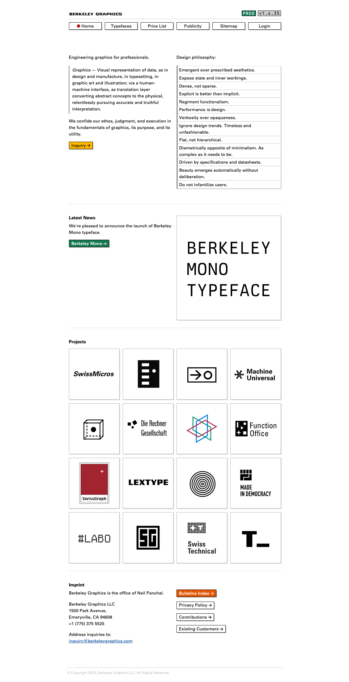
Don't pretend something isn't a complicated computer program when it actually is. Don't layer on leaky abstractions that just make everyone's life harder.
I started noticing more sites with unrounded rectangles.
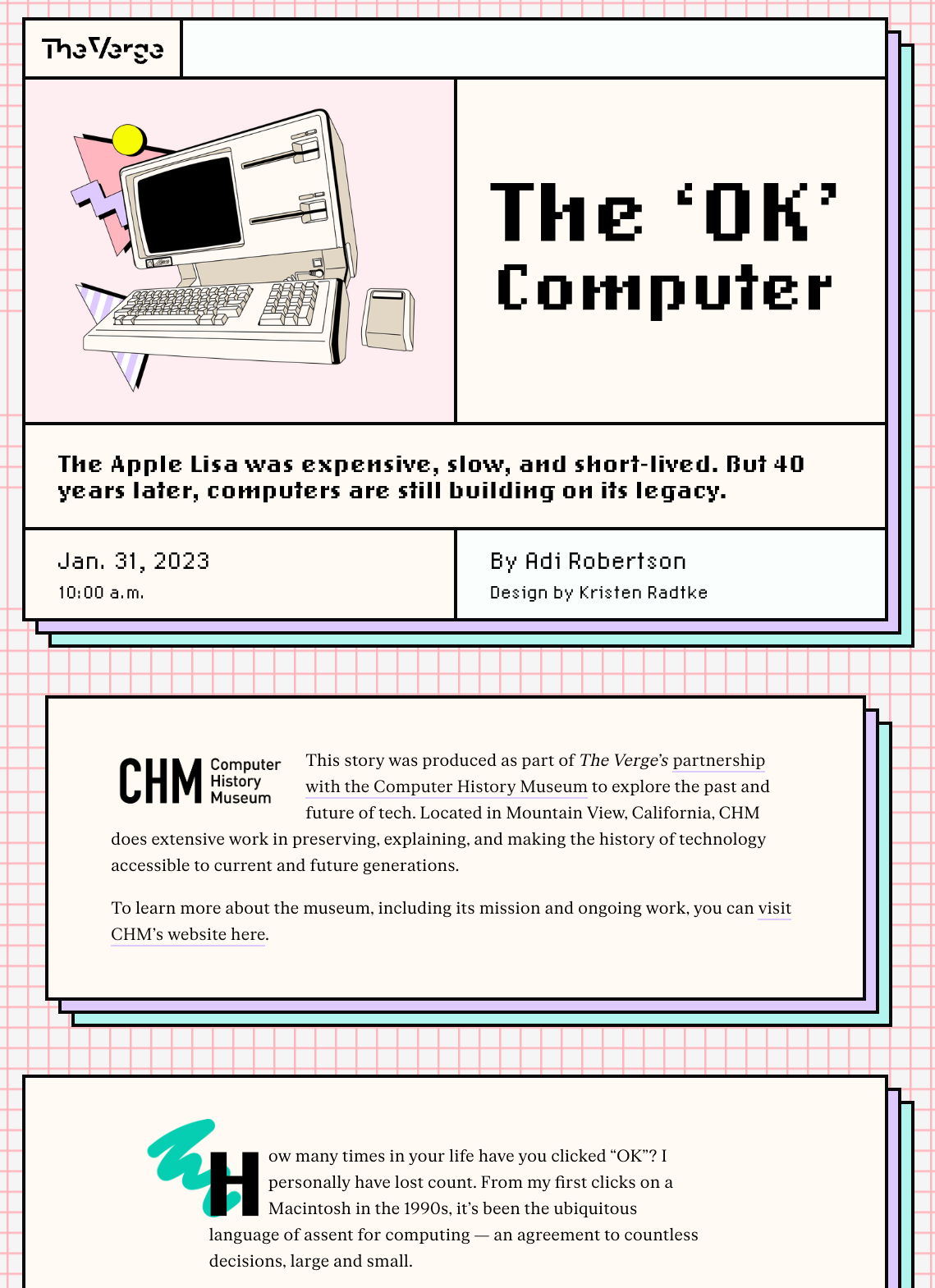
Yes, obviously a look back at the Apple Lisa is a natural fit for unrounded rectangles, but I couldn't help feeling there was an undeniable clarity that came with this design that wasn't just nostalgia kicking in. But that clarity didn't come at the cost of playfulness.
Most attempts at playfulness nowadays turn into bloated sites that take forever to load and have janky animations as you scroll down the page. Another example of failed friendliness: an attempt at playfulness ends up being less friendly than a site that loads quickly, scrolls naturally, and doesn't feel like it's breaking your browser.
It's explicitly a website, but there's fun that can exist within that form without pretending to be motion graphics from a product video.
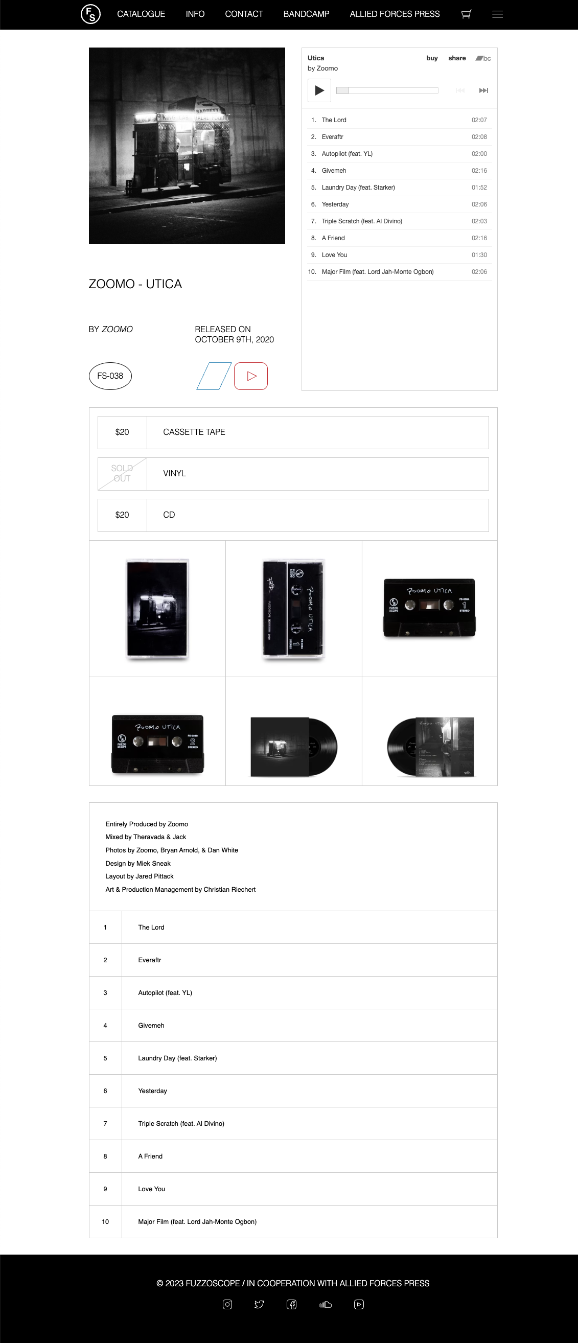
Fuzzoscope is a record label focused on beat/rap tapes. At this point I realized I had to concede that, yes, all of these sites were playing on some sort of nostalgia.
Berkeley Graphics harkening to "computer programs for professionals", The Verge looking back at the Apple Lisa, and Fuzzoscope looking back at a time when people would record cassette tapes of beats and raps.
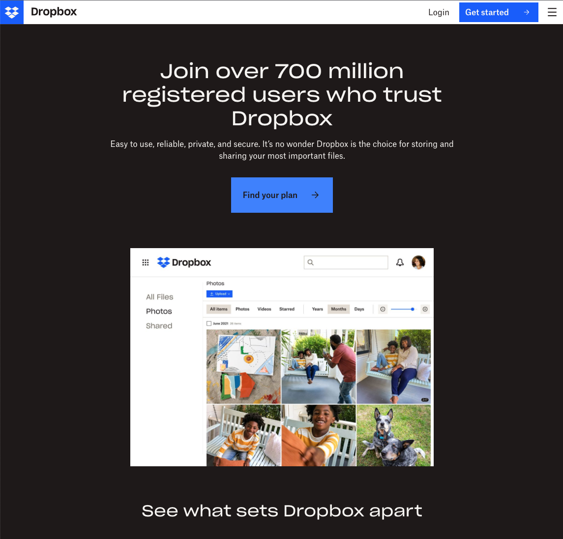
I think the most ironic example that proves the theme is Dropbox. In 2023 Dropbox seems based around the opinion that "the file system still matters".
In an era of Apple iCloud magically putting everything in the cloud, and letting the app layer define the storage of your digital belongings, Dropbox feels like a holdout with the opinion "this photo is a png file, not an entity in Photos.app". The only reason to use Dropbox is if you're old school in the sense that you still think about your files as files.
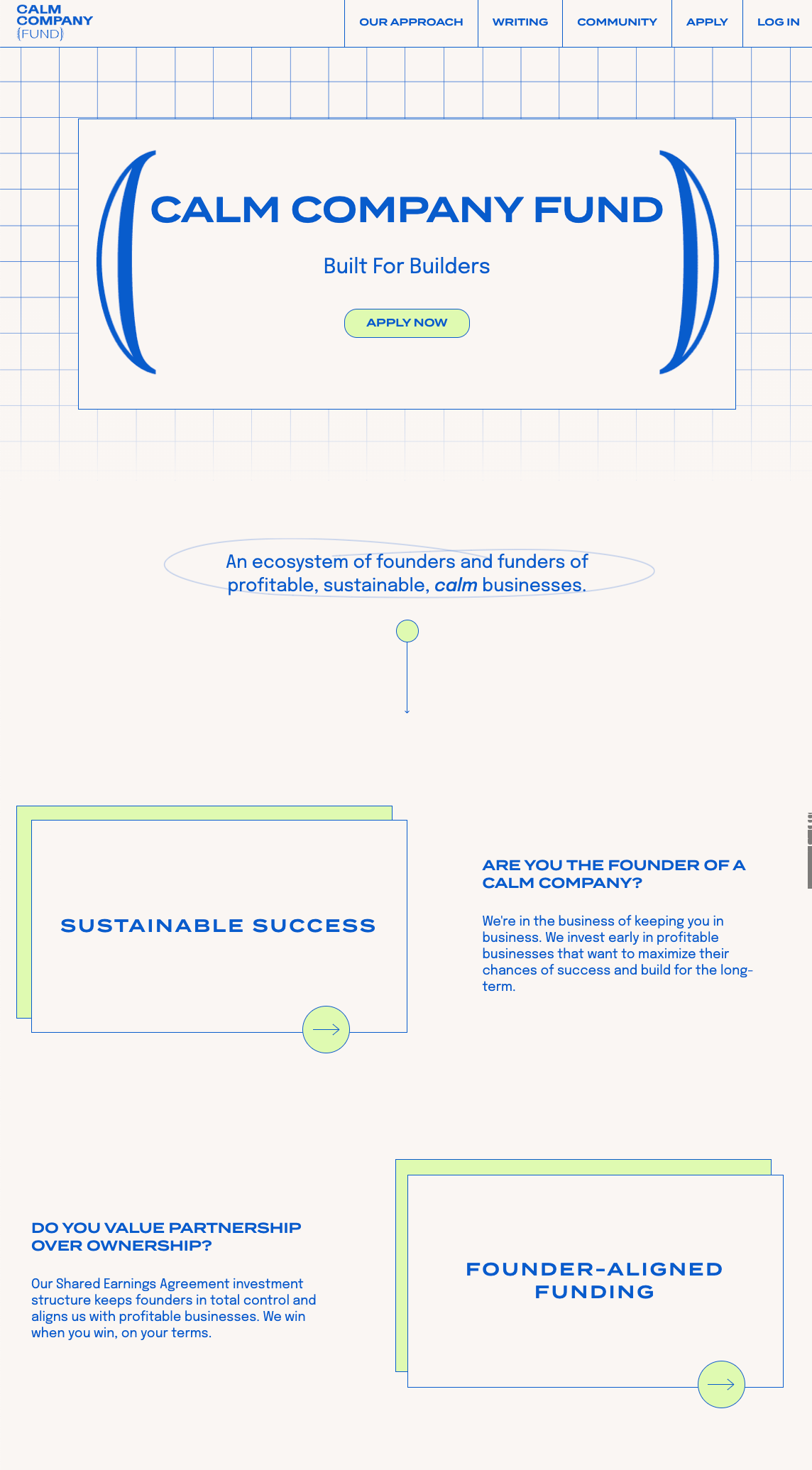
The last example I'll give is Calm Company Fund. "Built for Builders" is their tagline, and the unrounded rects give the site a blueprint-y functional feel. Similar to Berkeley Graphics this conveys a "we're for professionals" vibe. I don't have much to add, I just like how this site looks
In the end, nostalgia is empty when there's nothing new that can be retrieved from the past you're looking back to. Classic rock is empty nostalgia because no one has, and no one will, write a new classic rock album that supersedes the classics of the era. All we have left are cover bands playing in bars.
I'd argue that unrounded rects are not empty nostalgia. I think they point to a time and ethos around software that can be valuable in 2023. Yes, the best of the best consumer platforms like Apple builds will still be able to pull off abstractions that are strong enough and friendly enough to be valuable and worthwhile. But for the rest of the world building software it's hard not to yearn for software that didn't put on a false layer of friendliness.
Think about the last government site you visited. They don't have the time, resources, or energy to add a friendly layer of abstraction on top. You find yourself lost on a webpage trying to be "friendly" but find that the pdf of the document you're trying to understand ends up being the only foothold to clarity that actually exists.
So, yes, nostalgia for the unrounded rect is real. But also maybe they contain something we can bring into the software we build in 2023.
Member discussion